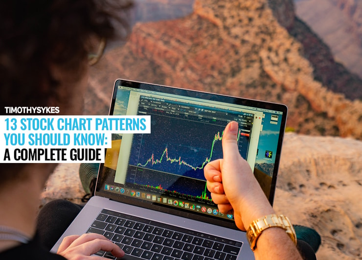
Stock chart patterns are everywhere.
Patterns are the regular sequences we can make out around us. Stock chart patterns are price movements that occur often enough to be identifiable.
The reason I teach Trading Challenge students patterns is because…
… they happen again and again. Which means they may be predictable.
But just because you know and recognize a pattern doesn’t mean you’ll find success with it. There’s MUCH more to trading than patterns.
Pattern/price is one of seven key indicators I use to determine if a trade is worth the risk.
New to trading? Start with my free penny stock guide or my low-cost 30-Day Bootcamp. There you’ll see what you can do with these patterns.
Table of Contents
What Are Chart Patterns?

Stock chart patterns are the recognizable price trends that stocks follow repeatedly. If you can recognize patterns well enough, it can be like seeing the future.
And the more you study their forms, the better you’ll get at spotting them.
Do Chart Patterns Work?

One reason I’ve made more than $6 million in trading profits is because of these patterns.* I’ve kind of got a sixth sense for them now.
The first thing to understand is that they’re real things. They show people actually buying and selling shares. They’re a visual representation of the market.
How well a chart pattern can work can change over time. And sometimes patterns won’t work at all.
(*My profits aren’t due to some magic formulas — it’s a product of hard work, experience, and dedication. My results aren’t typical. Most traders lose money. Trading is inherently risky. Do your due diligence and never risk more than you can afford to lose.)
How Many Chart Patterns Are There in the Stock Market?
There are a TON of patterns and variations on patterns. There are arguments about patterns, disagreements about acceptable time frames for patterns…
There are only about a dozen patterns I consider relevant. I only trade a few select patterns. At any given time I focus on one or two. I rarely stray from the pattern I’ve been leaning on until it stops working. Then I adapt.
What Is a Stock Pattern Screener?

A stock chart pattern screener is one of the holy grails of stock technology. There are AI-assisted pattern search engines currently on the market. But I can’t recommend relying on them exclusively. You need to understand why an algorithm likes a stock before you trade.
Get yourself a good stock screener like the one I use and helped design, StocksToTrade. It gives you access to beautiful charts, built-in scanners, news feeds, and more. Check it out with a 14-day trial for just $7 today! Or get it with the game-changing Breaking News Chat add-on for $17.
Then, learn these patterns like the back of your hand.
(I’m an investor in StocksToTrade and helped design it to fit the penny stocks I love to trade.)
Types of Chart Patterns
Let’s look at patterns on a systematic level.
Patterns help us understand what a stock’s current activity means for its future. This is all I care about. Will the shares rise, or will they fall?
That’s why I don’t mess with the really geeky technical indicators…
I believe in keeping it simple. The following groupings cover the basics.
Continuation Patterns
A continuation pattern points toward the trend in price action continuing. If it was going up before, it will continue going up, and vice versa.
Reversal Patterns
Reversal patterns are just the opposite. After the pattern plays out, the trend is likely to reverse.
Bilateral Patterns
A bilateral pattern could go either way. Buyers and sellers are evenly matched, and the price action bounces back and forth. This happens a lot in a volatile market.
Why Should You Learn Stock Patterns?
Humans like patterns. We’re drawn to them and seek them out. Check this out…
Because humans crave the regularity of patterns, and they’re so appealing to our psyche … we search for confirmation. We like to be right.
That means price action that looks like it could be a stock chart pattern … has the potential to turn into a self-fulfilling prophecy.
That’s probably the most important idea in this entire post.
Why Is Pattern Recognition Important for Trading?
Traders like patterns. Many technical traders watch and wait for the right price action. They want to see the chart confirm their thesis before they enter a trade.
They plan trades according to how the pattern should play out.
When enough traders have the same thesis and make the same move in a short period of time, the pattern plays out. Somewhat predictably. It’s one of the great cat and mouse — or bull and bear — games of all time.
But every trade is different. It’s not an exact science. Sometimes the pattern doesn’t work. You WILL take losses as a trader — it’s part of the game. My goal is for you to learn to take losses the right way.
What if the pattern doesn’t play out? Get out fast. Rule #1 is to cut losses quickly.
Which Patterns Should You Look For?
As a member of the Trading Challenge, you need to know which patterns I trade. Focus on the patterns my top students and I teach. I’ve been trading for 20+ years and teaching for 10+.
If you study hard, it’s possible to learn the patterns I teach in a few years. (It depends on how much you study and how fast you learn.)
Big picture: Learn as much as possible about every stock chart pattern.
Don’t be fooled into thinking you’ll understand the details and nuances of every pattern in a short time. It’s not an exact science.
Why learn patterns you won’t trade? Because someone out there will trade it. Like some newbie short sellers. They try to short anything that spikes — and that can lead to short squeezes.
Even if you don’t short, there’s opportunity. You can ride the long side of a short squeeze. Personally, I don’t like trading short squeezes. They’re choppy and they move fast. But every trader’s different.
Here’s a list of some patterns worth knowing. It’s not comprehensive. First I’ll give examples of some common chart patterns. Then I’ll give examples of a few of my favorite patterns. And last, I’ll give you some standbys for volatile markets.
Stock Chart Patterns Worth Knowing
Don’t consider this a stock chart pattern guide — it’s more of a cheat sheet.
Again, I don’t trade every pattern. Nor should you. Learning to recognize stock chart patterns can give you an idea of possible outcomes. It can help you understand possible future price action.
Candlestick Patterns
Candlestick charts use Japanese candlesticks to represent price movement. Steve Nison introduced these to the West in his classic chart patterns book, “Japanese Candlestick Charting Techniques.” Most traders I know use candlestick charts.
(As an Amazon Affiliate, we earn from qualifying purchases.)
Learn more about how to read candlestick charts here. You’ll see examples of some of my favorite patterns, too. This basic diagram will help you with the rest of this post:
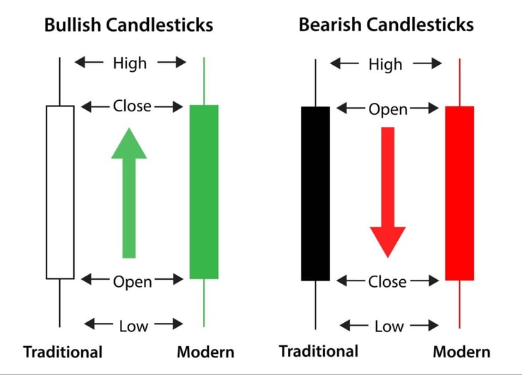
Keep in mind that candlestick charting techniques are a study in and of themselves. If you want the ins and outs, read Nison’s book. Then study historical charts in different time frames and backtest what you learn. And just like all patterns: adapt to the current market.
Bull Flag Pattern
The bull flag pattern is a continuation pattern. The price action looks like a flagpole, a flag, and a breakout.
What to look for: A strong upward trend followed by a consolidation period. During the consolidation, the stock trades within a narrow range, forming the flag. Then there’s a strong breakout over the consolidation range.
The body of the flag is a battle between the bulls and the bears. Let’s look at an example with Kraig Biocraft Labs (OTCQB: KBLB) that ran off its highs. It spiked on June 17, 2019, providing a great example of an intraday bull flag pattern.
Check out the chart:

Notice the midday spike (flagpole) followed by a period of consolidation (flag). Then the stock broke out and continued up.
Inverse Head and Shoulders
A head and shoulders pattern has three peaks, with the middle being the highest. The inverse head and shoulders pattern looks the same as the head and shoulders, except it’s upside down. Both head and shoulders patterns are reversal patterns.
What to look for: In an inverse head and shoulders, the price is trending down before the left shoulder. The shoulders have higher lows than the head. Coming out of the right shoulder, the trend has reversed from downward to upward.
Take a look at the Social Reality Inc. (NASDAQ: SRAX) chart below:

Notice the volume spike as the price breaks through resistance out of the right shoulder. This isn’t a perfect inverse head and shoulders. But most patterns aren’t perfect. That’s why I’m including real stock charts instead of graphic representations.
Cup and Handle Chart Patterns
The cup and handle is a breakout pattern.
What to look for: A cup and handle looks like a cup with a downward-sloping handle. The handle is a brief pullback coming off the cup’s left rim. The cup and handle pattern is most commonly considered a multi-day/multi-week pattern. But as with all patterns, they can and do happen intraday.
Check out the REEMF chart below:

Rare Element Resources (OTCQB: REEMF) is a clear example. The stock was a multi-day runner near the end of March. Then it dropped after the company did a financing. It consolidated in a nice cup shape, getting back near the April 2019 high on May 20.
Then it pulled back and consolidated, forming the handle part of the pattern. On May 28, news suggested China could withhold rare-earth metals from the U.S. due to the trade war. REEMF went full supernova on May 29 — spiking 124% in one day.
Pennant
A pennant is a variation of the flag pattern.
What to look for: In the pennant, the price action narrows. Lower highs and higher lows converge until the bulls and bears are at a standoff. Some analysts require a specific number of up and down moves before they consider it a true pennant. Whatever.
The point is, when a stock spikes and then bases or consolidates, it’s proving it can hold the new level. The exact shape doesn’t matter too much.
If the stock holds, it can lead to another breakout. That’s what bull flags and pennants do. But keep in mind, sometimes there’s a fake-out instead of a breakout. Other times the stock tanks after consolidation.
That’s why pattern/price is one of seven indicators. It’s only 20% of my reason for a trade. You can use the Sykes Sliding Scale to help you determine if a stock has more going for it than just a pattern.
Check out the chart for Nightfood Holdings Inc. (OTC: NGTF) below. As you can see, more than one pattern discussed in this post is on the chart:

From the end of November 2018 to the beginning of February 2019, the candles formed a cup and handle. It’s not perfect, but you get the idea.
Then the stock spiked 154% in two days on news that Nightfood’s ice cream scored a “product of the year” award. For the next 19 days, it consolidated in a pennant formation. The breakout on March 12 had another 35% of upside. There was also a beautiful first green day gap up at the market open on March 13.
Here’s another pennant example…
Zalemark Holdings Co. Inc. (OTCPK: ZMRK)
ZMRK spiked based on a letter of intent to acquire AeroPonLeaf Canada.
Check out the chart:

The above chart is a five-day chart with five-minute candles. I’ve drawn in yellow lines to show the pennant shape.
Now take a look at ZMRK again — this time the chart is a 15-day chart with one-hour candles:

Again, the yellow lines indicate a triangle/pennant shape on the chart. I included this chart to show you how important it is to look at different time frames.
And I hope you research this stock to see what happened next. Did the triangle formation consolidate into a continuation? Or was it a fake-out?
Some of My Favorite Patterns
So far I’ve shown you a few of the patterns you should learn. Not necessarily to trade, but to understand what’s happening when you see them. Preparation is key.
I’ve been trading the following patterns for two decades. And they’re still relevant.
I have a few haters who claim I teach 20-year-old patterns. They’re right. The patterns keep happening. Why would I stop teaching and trading them if they still happen?
Again, how well a pattern works can change over time. That’s why you have to adapt.
The Stair Stepper
On June 17, 2019, UP Fintech Holding Ltd (NASDAQ: TIGR) played this pattern out from market open through close.
Here’s the chart:

It consists of uptrending moves with brief periods of consolidation or slight pullback. It looks like a staircase. Again, it’s not perfect. Notice the yellow lines on the chart that approximate a series of steps.
Quick note: the TIGR chart uses five-minute candlesticks. When I looked at one-, two-, and three-minute candlesticks, some of the steps looked more like bull flags. One was a clear bull pennant.
This is another example of why you need to look at different time frames when planning trades.
Want to know why I look at multiple time frames when considering a trade? Find out what my top Trading Challenge students know and apply today.
Supernova
You’ve seen one supernova on the REEMF chart in the cup and handle section above. Here’s another supernova: Akerna Corp. (NASDAQ: KERN). First, look at the one-year chart:

Notice how KERN did nothing for most of the year. Also, notice the volume spikes back in October 2018. That was the result of the announced merger between two companies. One’s a software company for the cannabis industry.
On June 19, 2019, the new company started trading on the Nasdaq and went supernova.
So a company trading around $10 per share jumped to $80 in one day. The volume spiked from roughly 41K shares traded per day to 20 million shares. In one day.
Midday or Intraday Breakout
This isn’t one of my favorites unless several other indicators come into play. But it’s worth including. Several students report success with midday breakouts.
Remember KERN from the last example? Here’s how the stock turned into a supernova. First, look at the intraday chart:

The stock spiked at the open and by 11 a.m. had nearly doubled in price. This is where it gets interesting — even though it pulled back a little, it held most of its gains. It proved itself. I added the pink line to show where resistance became support in the $27–$28 range.
Then, around 2:45 p.m., volume started to pick up, and KERN was off to the races. By the close, it had teased $50, and after hours it kept going. It later dropped, but what a huge run!
4 Key Charts for Riding Volatility

I saved my standbys for last. These patterns got me through the volatile 2020 market.
First Green Day
Breakouts are price movement through historic resistance. With OTC penny stocks, a lot of the time this comes with news, which causes a spike in trading volume. These spikes can make for crazy percent gains.
OTC stocks don’t get a lot of media coverage. So if you’re paying attention, you’re ahead of most of the market.
Look at this chart. You’re already paying attention the day the news hits … and you’re watching when it goes supernova.

Multi-Day Breakouts
The lack of coverage also means people are coming in late to breakouts. You’ll usually get a few good days off solid news. So there are plenty of opportunities to trade for small gains.
Here’s a multi-day and multi-week breakout. That uptrend of the chart gives me confidence in going long after the first green day.

Morning Panic Dip Buy
Penny stocks are mostly built on hype. A promotion brings traders in, and the stock goes up … but sooner or later it’ll come down.
To be clear, this is the vast majority of penny stocks. You want a bit more than hype for a good dip buy.
This is my favorite pattern because you’re using the psychology of the market. People who missed out on the run-up want in on the bounce. And short-sellers are buying the flattened shares.

First Red Day
What goes up must come down … When traders get stopped out it can come down quickly!
I don’t do a lot of shorting these days, but some experienced traders like to short first red days.

Frequently Asked Questions About Stock Chart Patterns

If you still have questions, that’s a good thing. Your favorite patterns should take you years to learn well. Stay curious!
What Is the Difference Between Bullish and Bearish Stock Chart Patterns?
Bullish patterns show a market dominated by buyers. They’re testing the stock’s resistance and seem likely to break it. Bearish patterns show the opposite.
What Are the Best Stock Chart Patterns for Day Trading?
I love to dip buy penny stock morning panics. Instead of real demand driving these panics, you’re dealing with the psychology of the market. If you can make sniper-like trades for these former pumps, you can benefit from their frequent bounces.
What Is the Most Successful Stock Chart Pattern?
Multi-day breakouts have been good to me lately. Look for the trend and be religious about taking singles.
What Are the Most Profitable Chart Patterns?
There’s one I call the millionaire pattern. It starts as a multi-day run-up. The stock goes parabolic supernova. Then it crashes intraday and bounces again. If you can catch it on the way up both times, you can potentially ride the momentum. But it moves fast. So go in prepared and with a plan … and always be ready to cut losses quickly.
In Closing
It’s important to know patterns. But it’s different when it comes to trading.
Not all patterns are created equal. I have no intention of trading patterns I don’t like.
That doesn’t mean you can’t or shouldn’t trade a pattern I don’t trade. You MUST figure out what works for you and what fits your comfort level.
Study the examples in this post. Then watch for these patterns as you add stocks to your daily watchlist. You might be surprised how often these patterns appear.
Trading Challenge
That’s a lot of information for one post. Remember, it’s a marathon, not a sprint.
It takes lots of studying and practice to learn it all. And you will lose — especially at first.

My goal is for you to lose as little as possible as you learn the nuances of trading. That’s why my team and I created the Trading Challenge. I think it’s the most comprehensive trading course you’ll find anywhere.
If you’re serious about the potential for freedom and an awesome lifestyle from trading…
… apply for the Trading Challenge today. But only if you’re ready to do the work.
Which stock chart patterns do you use to trade? Comment below and share how you’ll apply what you learned here today. Use it or lose it!

Leave a reply