This is a trading challenge student guest post for all you chart lovers out there:
Candlestick charts are attributed to the Japanese and an apocryphal story involving a man tracking the price of rice for a year, noticing the seasonality and expertly buying and selling rice to exploit the patterns he discovered.
That story holds meaning regardless of whether it’s true. Any asset that is traded on a market is affected by seasonality.
You hear it with adages like selling in May, or even Black Friday for retail stocks.
Companies report year-over-year growth results in order to compare the same time period per year, in an effort to account for seasonality.
The stock market is more complicated than a crop like rice, and there are intervening factors that can interfere with the seasonality trends.
A second great benefit of the candlestick charts, as opposed to line charts, is that they are great indicators of momentum.
Momentum, being the combination of volume and movement, does incorporate all the aspects including seasonality and the intervening factors whatever they may be.
Being a solid depiction of momentum with numerous is what makes candlestick, and the OHLC charts, the primary chart style for traders.
A lot of new traders tend to use line charts, because they are the cleanest and the ones people are most familiar with.
Most chart patterns are based on candlesticks, which is the reason that OHLC charts are not used most often.
Table of Contents
Data, data, data

The quote from the Sherlock Holmes movie is very apt at describing candlestick charts in comparison to the simple line chart.
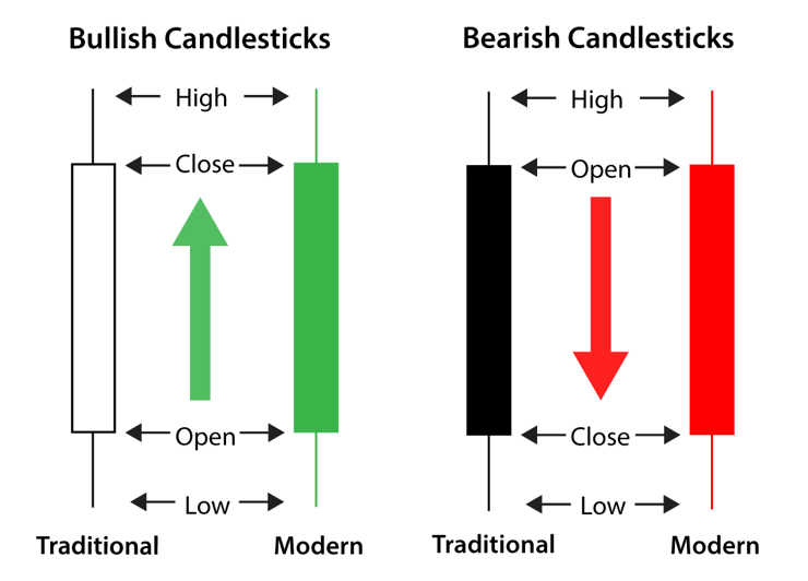
There are 4 data points per interval as compared to line graphs. A candlestick is composed of the high, open, close, and low of the particular interval chosen per candlestick, just like the OHLC chart.
The wicks are the high and the low, with the ends of the bar forming the open and the close.
Whether the top one is the open or the close is determined by the color of the bar.
Red is universally down, but positive bars can be green, blue, clear, or black depending on the specific chart used.
Four data points yield a lot of information, and better capture the momentum of a stock. Assuming you have a regular uptrend on 5-minute bars seeing a long wick on top but a red bar can mean the end of current trend for a pullback.
Day traders who use large accounts and leverage can trade these signals for a profit consistently.
There are lots of ways that a candlestick chart can signal to the trader that a pattern is changing or forming.
The quicker the interval per bar the more subtle the trends that can be detected.
These trends are small movements in absolute terms, but day traders have a large amount of leverage at their disposal, and usually do not trade with tiny accounts.
There can be many trends identified per day and just looking at one stock and one chart can keep a trader busy, and following just a handful of stocks can yield trades day after day.
Timings and Intervals
Larger intervals for the candlesticks steamroll over the subtle trends but each bar incorporates more information due to the greater amount of time. As the interval on the bars increase that piece of information can be considered more substantial.
A signal on a 15-minute bar is more trustworthy than a 1-minute bar.
There are diminishing returns as time gets greater, and as you move into the extreme levels charting becomes less useful.
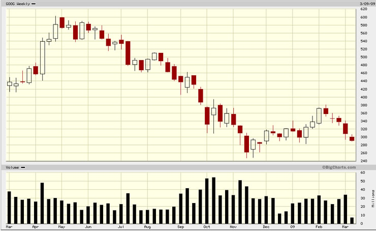
Do not use weekly candles and assume that all the signals are accurate, because lots of things can interfere with the chart signal with stocks.
Charts might not be great indicators over vast periods of time, though even then they can be useful, but from just the chart and perhaps some other indicators a skilled trader can guess at the near-term trend with a high level of accuracy.
Profit depends on the execution of the trade, but even being able to see the patterns is impressive. Charting is a vast subject that needs to be tackled methodically, and it takes time to learn all the ins and outs. However, it is an extremely important part of a short-term trading strategy.
The Doji – Arguably the most Important Candle
A doji is a candle where the open and the close are at the same level or nearly the same level. There are many variations that focus on the length of the wicks that form the top and bottom of the candle, but they should all be considered doji candles. Doji’s are one of the key ways to find reversals, corrections, and other things signaling the end of a trend, but on their own are neutral signals.

A consistent downtrend of red bars can end in a doji or at least pause. In the example above, the doji signaled a reversal to the upside after three red days. The reversal didn’t last long, but it’s a good example of the psychology at play. A series of doji’s can indicate a plateau with minute variations giving clues about the direction of the next short-term trend.
There are many other patterns, but the doji shows up in them more than most others.
This is why it is important to know, as it shows up the most on candlestick charts and has a particular importance. It is also the most easily identifiable on quick glance.
Conclusion
Charting is difficult to learn, because there is so much to learn. Stick with it, and do not rush it. It takes time to apply everything well. It along with other technical indicators form the basis for most short-term trading strategies. Even between days it is very useful. Only when you start going into weeks and months does charting need to be balanced with other things.

Leave a reply